Marketers love saying it: popups are powerful.
But I like to add: they can also be a total waste of your time.
It’s not enough to have an exit-intent popup plugin on your website and make something pretty to show your visitors. You have to be strategic, informed, and able to design a heckuva popup.
Because it’s not enough to just catch the eye of the visitor with your popup: you want to convert them into followers and, eventually, loyal customers. For this, you only have a few short seconds…
With that in mind, here are a few exit-intent popup best practices for you to use on your own website:
Exit Intent Popup Best Practices
1. Be Bold & Clear With Your Invitation
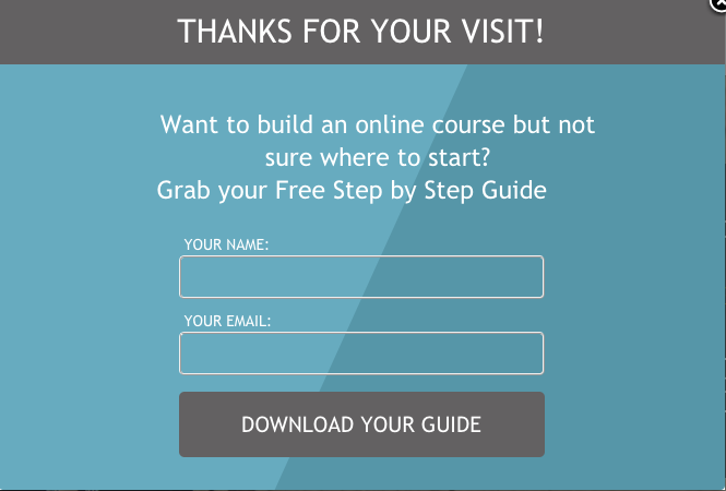
One of the biggest mistakes you can make with your popup is trying to pack too much onto it.
Think of your popup, instead, as if it were a highway billboard. With only a few seconds to grab the attention of passing vehicles, billboards really have to have their A-game on.
Likewise, the message of an exit-intent popup should be short, clear, and totally unforgettable…is yours?

2. Make It Responsive (Mobile-Friendly)
Let it be known: exit-intent popups do not work on mobile devices…simply because they work only when a “cursor” is moved away from the page. Since there’s no way to indicate a cursor on a mobile device, the exit-intent popup simply won’t be activated.
But you can still keep things mobile-friendly in other ways:
For instance, you might choose to disable the exit intent for mobile visitors…and replace it with a scroll-based or time-based popup, instead.
And, when working on your design, refer to Google’s new guidelines concerning mobile-friendly popups.
3. Use A/B Testing
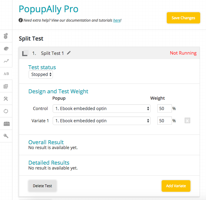
A/B testing will allow you to see at a glance what’s working and what isn’t for your popups.
Simply create a couple of different popups with slight variations in color, content, etc., and let the split testing feature do the rest.

If you’re using PopupAlly Pro, you’ll automatically have access to A/B testing to make sure your popups are always converting efficiently!
4. Always Monitor Conversions
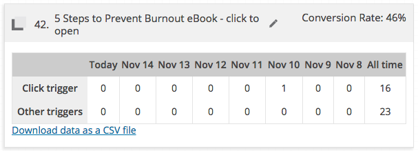
Keep close tabs on your conversion rates. You’ll be able to quickly tell when it’s not performing as planned, giving you enough time to head back to the drawing board for some more tweaking.

When used in conjunction with A/B testing, exit-intent popup statistics will really get your site rolling.
5. Keep It Consistently Branded
That’s one of the key exit-intent popup best practices to keep in mind.
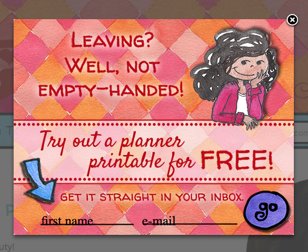
Remember: your exit-intent popup has (essentially) the same function as a billboard. It’s gotta be designed to capture the attention of a person who’s already heading somewhere else…and getting them to take action.

The design of your popup should scream with your business’ branding so that your ideal clients are less likely to pass on this final offer.
If, on the other hand, the popup looks like an afterthought, people will treat it like one.
6. Stay Honest & Truthful
Always under-promise and over-deliver… especially when it comes to the message on your exit-intent popups.
Because really, it doesn’t matter how many people opt-in to your exit-intent popup. If the content doesn’t live up to your promises, they’ll never turn into paying customers.
Instead, keep things clear, inviting, and realistic. This offer is going to be the “first glimpse” that someone gets into your gated content.
7. Ask A Good Question With A Mini-Survey
Who says you have to stop at a basic email optin when it comes to designing your exit-intent popups?
Using something like the mini-survey (available with the PopupAlly Pro plugin) can be a great way to add a little more fun to the interaction.

Instead of a basic “yes” or “no,” you can also use the two options as a way to segment your web visitors. Do this by providing two offers that they can choose to click on. It’s a great way to be a little more personal and appeal to a deeper problem or need that your visitors have.
8. Use A Powerful Tool
Here’s the thing: if your exit-intent popup is tardy when loading, you’ve already lost the precious milliseconds needed to capture the visitor’s attention.
So always use a powerful, trustworthy popup plugin to ensure that it’ll show up when you tell it to.
The right exit-intent popup plugin will also include the additional features you want, like A/B testing, statistics, and great templates to start your designs with.
9. Let Them Say No (If They Want To)
I know…we don’t want anyone to say “no” to our offers, especially when we’re giving them away for free.
But when you give someone permission to say “no,” you give them permission and incentive to trust you.
So make that “X” prominent enough to allow them to click away easily if they so choose. Don’t make it block the whole mobile screen to try to force them to opt in. And definitely be polite if they do decide to turn you down.
Because you don’t just want the opt-in. The long-term plan is (or should be) to build a relationship with them and turn them into loyal, paying fans of your online business.
10. Use Other Types Of Opt-Ins, Too
This definitely needs to be stressed: exit-intent popups are great, but they’re not the only effective type of popup! Use scroll-based popups, timed popups, even embedded optins to capture the attention of your visitors.
Exit-intent popups definitely excel at the polite “hey, I’ve got a gift for you before you leave” statement…but you should try to capture your opt-ins before your visitors even think about leaving your site.
By using a combination of popups and optins, you’re able to reach your visitors at every stage of their online journey.
11. Be Polite & Don’t Keep Bothering Them
Getting personal here: I get mildly (super) annoyed when I’ve opted in to someone’s list…and still get bombarded by their optins every time I return to their site.
In fact, one particular site (whose author I totally respect & admire) became so irritating with the popups that I finally got fed. I made the conscious effort to log into my email, hunt down the latest newsletters by that person, and unsubscribed to each and every one of them.
…and I’ve never returned to their website.
All because I was tired of having to constantly reject their optins.
So don’t do that to your subscribers!
Use a plugin with a feature like PopupAlly Pro’s polite subscriber recognition to ensure that you stay on the good side of your subscribers.
And Keep On Keeping On!
Whether we’re creating them or opting in ourselves, most of us have some experience with exit-intent popups. If you have the wisdom to share – or any of your own exit-intent popup best practices to add to the list – share it in the comments below!