So you’ve decided to install a WordPress pop up on your website… but maybe you’re stumped because all of the pop up examples you’ve screen across the web look kind of generic.
Well you’ve come to the right corner of the internet, because in this post we’ll be looking at the best pop up examples from creative PopupAlly Pro users.
You’ll notice that each of these pop ups are unique, fresh, and totally on brand.
In my humble opinion, if your lightbox popup doesn’t mesh with your site’s design and brand… then it’s going to rub your readers the wrong way, and that’s when you get into that “annoying popup territory”. Not cool!
You’ll find examples of simple and to the point pop ups that just work. You’ll also see how creative entrepreneurs and business owners are using pop ups to grow their email lists in a polite way.
Find out how even these non-developers are creating totally customized opt-in pop up boxes that feel totally aligned, and get more people on their email lists.
Best Pop Up Examples
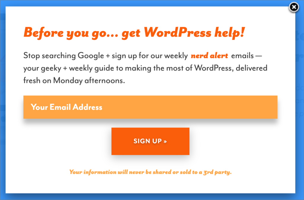
The wicked smart Alison Monday at tiny blue orange is using PopupAlly to create a polite popup right before someone is about to leave the website.
This exit-intent popup is the perfect example of a lightbox pop-up that speaks to what the reader might be looking for.
The colors match from the headline, the opt-in form, and the opt-in submit button, and there’s clear marketing copy with a strong call to action.
Overall, it looks classy, it gets straight to the point, and most of all… it converts.
Best Example Of a Diagonal Survey
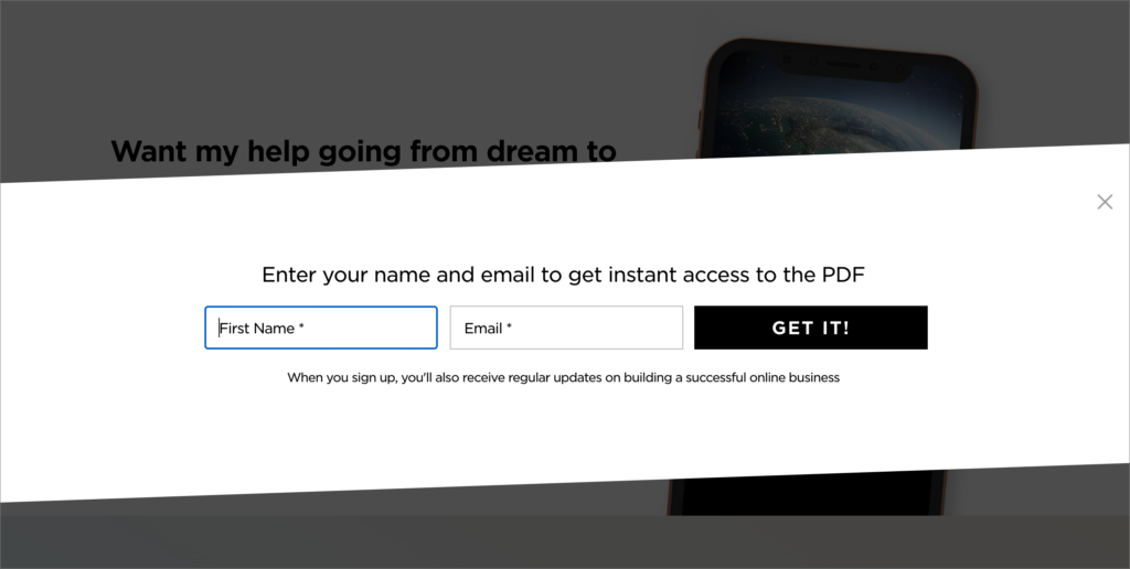
This is a great example of a click-to-open popup, that gives the person a reason to click a button, and on the popup is where you ask them for their name and email.
Here Luisa Zhou is offering a downloadable PDF after the person opts in, with a nicely designed diagonal popup.
This type of “2 step” opt-in is a great way to get a micro-commitment. That first click to open the popup is the first “yes” and once they’re here on the popup, it’s a matter of finishing the task they started.
This is truly a polite popup, and it helps convert better too.
Exit Intent Pop Up Example with a Time Specific Offer
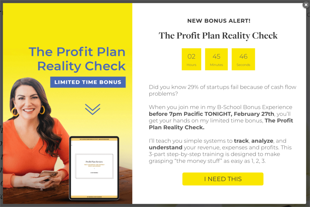
This is a great example from Amy Porterfield for a time-sensitive offer that shows up in a popup. This makes it more obvious that the bonus offer is going to expire, with a countdown timer right inside the pop up box.
I love that there’s a personable photo of Amy, along with a representation of the bonus so people can see what to expect when they take her up on this special bonus.
Plus, the “I need this” button is a great example of copy that speaks to how you want people to feel when they read your promises.
Two-Step Popup Example
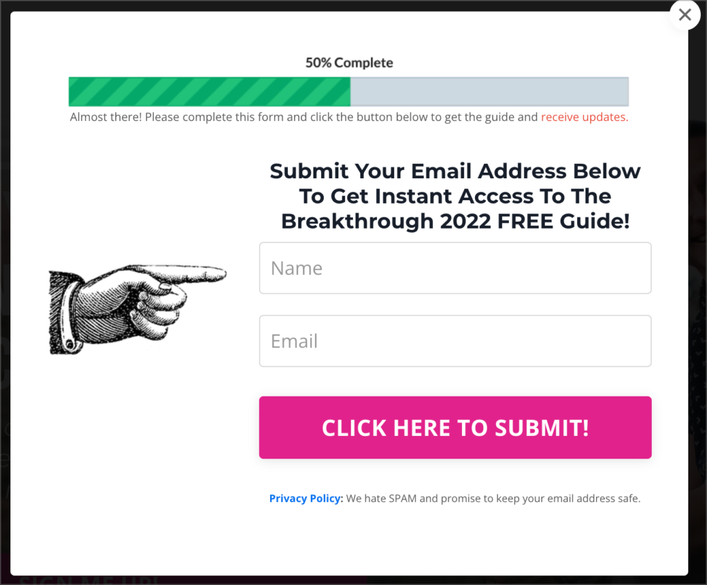
In this example from James Wedmore, you’ll see that he uses a click-to-open popup with a clear call to action for a free guide. Once someone clicks on the first button, they are taken to a two-step popup.
The great thing about this design is that there’s a reminder of what people will get when they complete their name and email, and it also shows them that they’re already halfway to getting their free opt-in.
The progress bar and the finger pointing to the opt-in fields are a nice touch!
Friendly & Effective Pop Up Example
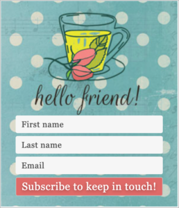
This is a friendly popup opt-in that is also used in the sidebar of the website. It’s a great idea by Gwen Elizabeth Brown, because she knows that she can design the opt-in once and use it in a variety of places on her site.
This is a really friendly and well-branded opt-in, that suits the design of the site beautifully!
Using a Popup for Cookie Consent

Here, Gwen Elizabeth Brown uses PopupAlly Pro for this adorable cookie consent option. While there are some WordPress plugins designed just for doing cookie consent, the way this one is done really aligns with her design and friendly vibe.
This cookie consent is perfectly branded, and have that personalized hand-drawn feel to them that makes them stand out. You know that this popup took some thought and there’s some heart behind, it too!
Tell Them What They Get Pop-up
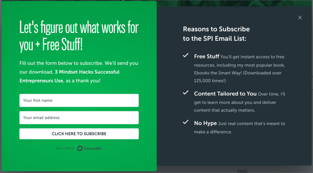
In this click-to-open popup, Pat Flynn from Smart Passive Income gives you a full checklist of what you can expect when you opt-in for the email list.
It’s a great way to get people who may be hesitant to enter their details into a popup form, because it tells you exactly what you get. You get a free ebook (plus the social proof that lots of people have already downloaded it), and all of the stuff that matters most like customized and tailored content that makes a difference.
There’s also a quick shout out to ConvertKit, since Pat is an advisor to the company and wants to represent them well, too!
Bottom Corner Scroll Activated Popup
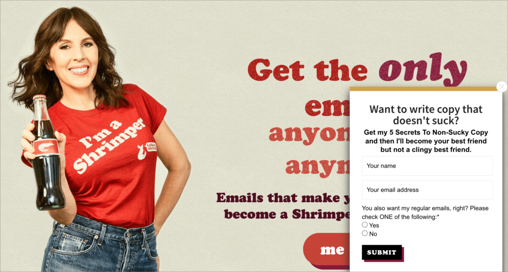
Here Laura Belgray of Talking Shrimp takes her copy genius to the next level, by asking a very good question. Then she gets right to the good stuff by telling you what you get when you opt-in.
The way this popup shows up in the bottom corner and after a certain amount of time or as a scroll popup is a great use of website real estate. It doesn’t block the whole page, and shows up to give you that next step.
The radio buttons that let you choose if you want regular emails or not is pretty smart, too!
Got More Pop Up Examples To Share?
These were just some of the best pop up examples we found on our first pass through our PopupAlly users’ websites and membership sites.
We know that there are new creative pop up designs being implemented on PopupAlly every day… so please leave a comment below and let us know if your site has a great pop up example on it! We might just feature you in a future post.