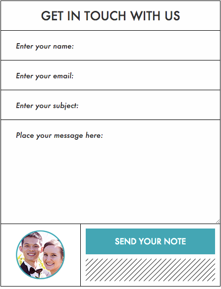
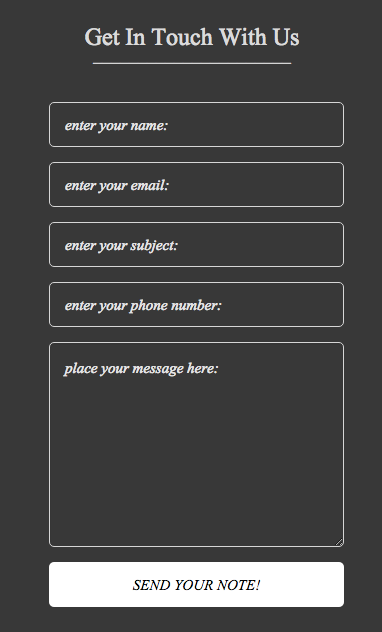
Why is the WordPress popup contact form so sweet to use? Because it gets your website visitors to click and instantly be able to email you and your team…without cluttering the interface of your website.
Since the contact form is super standard to most websites, you’ll notice that many themes and plugins come already equipped with one.
The problem, though, is that a lot of these contact forms are pretty bulky. They tend to take up a significant part of a page and don’t have a lot of design flexibility. That’s one of the reasons why there are so many sites with a big Contact Us link that leads to an entirely separate contact page.
Of course, to make it easier on your visitors, you might try to add a contact form to each of your pages…though that, too, might inhibit the website flow that you’re looking for.
And that’s where the popup contact form for WordPress comes in handy.
The Right Contact Form Builds Relationships
Relational marketing focuses on what your customers need and when they need it.
Whether you need help with a flooded basement, or rescue from a wild animal attacking your car, a good neighbor always shows up at the right time and place.
…this analogy might sound a little silly, but it does bring up a great customer service point.
In the physical world, it’s impossible to show up at the right moment every time. But a website is an entirely different matter.
For your customers and visitors, showing up at the right time, right place is key to building a solid relationship.
With a WordPress popup contact form, you can display a contact form right when people need it… at the click of a button.
Be There For Them, But Be Polite About It
Popups can sometimes get a bad rap.
Spammy websites especially will use them to force you into an “accidental” click.
So don’t be like them.
Fortunately, your popup contact form does NOT need to show up like one of those annoying popups that interrupt someone’s website reading flow.
With today’s technology, you can set up a contact form popup that opens within a split second of an intentional click of the mouse. These are called “click to open” popups, and are quite easy to setup using PopupAlly Pro.

A traditional contact form might offer a lot of flexibility in terms of what’s included on it. However, it will also take up a lot of space and is too intrusive to be placed as a static part of all those pages on your site.
Where Should I Put My Popup Contact Form?
Good locations for contact forms include:
- At the end of a post about a product
- on checkout pages
- on about pages
- and on product pages
Basically, any place where your visitors’ interest might be piqued is a good location. A contact form can capture that need for more information and encourage your visitors to take the next step and talk to you about what they’re seeing.
Perfect Controls for your WordPress Popup Contact Form
A click to open popup is a great feature…but how much is it worth to you?
Chances are, you want to focus on providing the best user experience on your website, not on spending hours learning to code in order to customize a contact form to fit your design.
It’s common sense.
That’s why, as you search for a WordPress contact pop up form that suits your needs, look for a product that combines intuitive user interfaces with limited coding requirements.

Here are a few of the features that will come in handy as you’re crafting your WordPress popup contact form:
A Contact Form That’s Mobile Friendly
Mobile is everywhere, and more and more your customers will be using a mobile phone and or tablet interfaces to interact with your website.
In order to streamline your site with the right contact forms, you need to be able to quickly see and edit the pop-up for multiple display sizes. Luckily, PopupAlly Pro lets you do just that.
An Intuitive Contact Form Designer
In techno speak, this is called a WYSIWYG (What You See Is What You Get) editor.
So, rather than learning the text call for the color of your background and entering it into a CSS sheet, you simply find the color you want and click on it.
You want to spend your time deciding what the contact form should look like, not stressed about what it does look like.
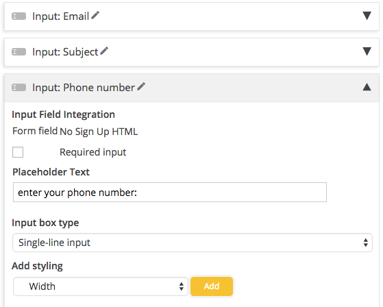
Fully Customizable Fields So You Can Ask For What You Need
When you install a contact form on your page about saving sharks, for example, you’ll want unique colors, shapes and text on the contact form. This is because a contact form about signing your petition will be entirely different from the contact form in your business section.
Design That Integrates with Your Site Seamlessly on WordPress
There are times when your contact forms need to be in the top, middle or bottom of your site as a permanent part of the page. In order to streamline your website with the right contact form it has to be fully functional as both a part of your web-page and a pop-up.
Perfect Control Of When a Popup Contact Form Shows Up
When do you want your contact form to appear?
There are a few options for you to choose from, including:
- Reading to the end of the page (scroll)
- Getting ready to leave your site (exit intent)
- Or the amount of time they have been on your page (timed)
Whether you want to advertise one last offer before they exit the door, or just provide help to someone who’s been on your site for a while, the right pop up contact form will communicate your desire and provide good service.
Page Specific Controls, To Give You Extra Information About The Inquiry
Your contact form can have different inputs or be pre-populated based on the page or blog post that it pops up on. This is useful if you have two types of potential clients, or if you want to get useful information about which pages tend to prompt more engagement on the part of your visitors.
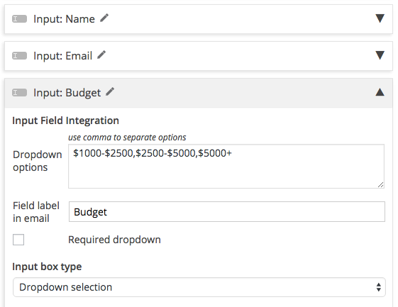
The Ability To Add Custom Fields Like Budget and Timeframe

Some of the fields that I always recommend adding for service providers is a “Budget” field and a “Timeframe” field.
This is because everyone has a different expectation of what things cost and how quickly things can happen.
As a freelancer or entrepreneur, you want to know what your potential client has in mind. It’ll help to sort out people who are in a hurry (in case you need to refer them to someone else), and those who aren’t willing to pay what you’re asking.
Not Just For Contact Forms
A contact form is one of many interactions your customers may need as they interact with your site, but a good pop up plugin will give you additional tools for the other optins you need.

Pro Tip: Increase the Quality of Your Leads By Implementing a Smart Contact Form
A WordPress popup contact form plugin that meets all of the above controls will allow you to streamline your WordPress site, deliver content seamlessly, and amp up your customer service…without interrupting the flow of your website.
Choose The Right WordPress Popup Contact Form Plugin
As a business owner, you want people to contact you with questions, concerns and recommendations. But for some of your business needs, the traditional WordPress contact forms are either too intrusive or they don’t show up at exactly the right time for your visitors.
You can get all of this information up front using a WordPress popup contact form, or embedded form if you want to make your form really inclusive… and you can do all of that using PopupAlly Pro in just a few minutes.
From now on, when people get in touch with you on your contact form you can have exactly the right information and you’ll be able to reply to inquiries in a much smarter and more personalized way, too.
Now go out and build yourself some great WordPress popup contact forms!