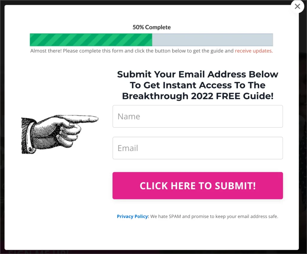
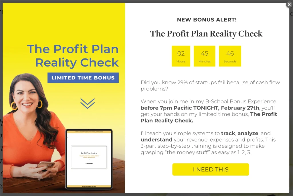
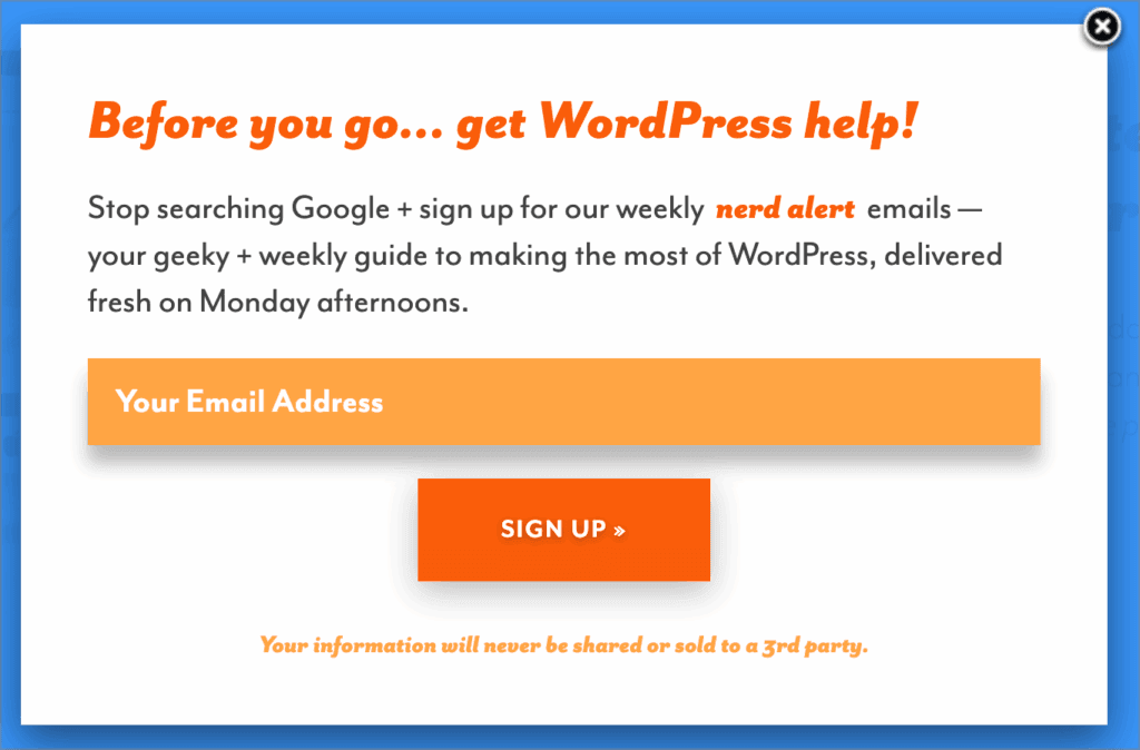
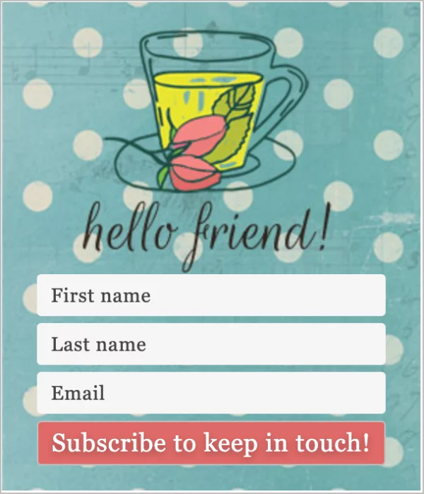
Popups get a bad rap. For many users, they’re the villains of the internet, popping up at the worst time, blocking content, and sparking instant annoyance. But when created thoughtfully, they flip the script. Instead of being intrusive, they become powerful conversion tools that guide visitors, highlight offers, and actually improve the browsing experience.
The difference between a popup that irritates and one that converts comes down to one thing – design. From layout and timing to copy and color choices, every detail matters. When you get it right, popups can feel less like interruptions and more like well-timed invitations that meet visitors exactly where they are in their journey.
That’s the focus of this article: practical and proven design best practices that turn popups into high-performing conversion assets, without frustrating your audience.
And the best part? You don’t have to be an expert to put them into action. With customizable templates from PopupAlly, applying these strategies is simple and seamless.
Why Effective Popup Design Is Important?
Popups aren’t just about getting something in front of your visitors. They’re about influencing decisions. With the right approach, a popup can:
- Capture attention at the right moment: A well-placed popup can highlight an offer exactly when a visitor is ready to engage.
- Guide the user journey: Instead of aimlessly browsing, users get a clear next step whether that’s subscribing, downloading, or buying.
- Boost conversions without extra traffic: You don’t need more visitors to your site – you need smarter ways to engage the ones you already have.
On the other hand, poorly built popups can undo all your hard work. Clunky layouts, bad timing, or pushy messaging often frustrate visitors, leading to higher bounce rates and missed opportunities.
That’s why great design is important. Every element you include in your popup can make the difference between an annoying popup and a non-annoying one.
Key Principles of Popup Design
At the core of every successful popup is thoughtful setup. It’s not enough to simply create a box with text and a button.
Every element, from the way it looks to the way it behaves, influences whether your visitor clicks “yes” or “close.” That’s why understanding what goes into popup is essential if you want to generate leads.
Great opt-in forms balances two things: grabbing attention and respecting the user experience. Lean too far in one direction, and your popup risks becoming invisible. Push too hard in the other, and visitors may be forced to leave. The sweet spot is found in applying principles that guide, not disrupt.
In the next sections, we’ll break down these principles – covering layout, copy, color choices, timing, and more – so you can start building popups that feel natural, persuasive, and highly effective.
1. Layout
A popup’s layout is the first thing people notice – and it can make or break whether they engage or dismiss it instantly. A cluttered look overwhelms the eye, while a clean, intentional layout guides visitors smoothly toward your call-to-action.
What are the Best Practices for a good Layout?
To create a good layout,
- Keep it simple: Limit the amount of text and visual elements so the message is easy to absorb at a glance.
- Use visual hierarchy: Make the headline the most prominent element, followed by supporting text, and finally the call-to-action button. This order naturally draws the eye where it needs to go.
- Leave breathing space: White space (or empty space) is just as important as the elements themselves – it prevents your popup from feeling crowded.
- Highlight the CTA: Place your call-to-action button in a clear, central location and ensure it stands out visually (through size, contrast, or color).
- Think mobile-first: On smaller screens, simplify even further. A popup should never feel cramped or force users to pinch and zoom.

A well-structured layout not only looks professional but also ensures your visitors don’t have to “work” to understand what’s being offered. Instead, their attention flows naturally from the message to the action you want them to take.
2. Compelling Copywriting
Popups can be great looking but still not inspire action if the words fall flat. Copy is where you connect with your audience – speaking directly to their needs, interests, and pain points. The goal is to be persuasive without being pushy, and concise without being vague.

Here are 3 Strong Elements of an Impactful Copy
- Clear headline: Your headline should instantly communicate the value of your offer with no jargon, no fluff.
- Concise message: Keep supporting text short and to the point. Visitors should understand what’s in it for them within seconds.
- Strong call-to-action (CTA): Use action-oriented words that emphasize the benefit to the user (e.g., “Get My Free Guide” vs. “Submit”).
4 Tips for Aligning Copy with Your Audience Needs
- Speak their language: Use words and phrases your target audience uses to describe their challenges or goals.
- Focus on benefits, not just features: Instead of “Subscribe to our newsletter,” try “Get weekly tips to boost your sales.”
- Address pain points: Identify what problem your audience wants solved and position your offer as the solution.
- Test variations: A small tweak like “Start My Free Trial” instead of “Sign Up” – can dramatically change conversion rates.
Remember: your popup copy should feel like a helpful nudge, not a hard sell. When you make your message resonate with what visitors actually care about, you increase the chances they’ll click “yes” instead of closing the window.
3. Color & Visual Appeal
Colors do more than make your popup look attractive – they influence emotions, guide attention, and even shape decisions. A popup with dull or mismatched colors can easily get ignored, while one with a strong visual presence can grab attention instantly and encourage action.
What Does Color Say to Your Visitors?
- Red and orange create urgency and excitement. Great for limited-time offers.
- Blue and green signal trust, calmness, and security – ideal for subscriptions or free resources.
- Yellow can spark optimism and energy but works best as an accent, not a background.
- Contrast matters. Your call-to-action button should stand out from the background so visitors know exactly where to click.

3 Tips to Creating Great Visual Appeal
- Stick to your palette: Use your brand’s primary and secondary colors so your popup feels like a natural extension of your site.
- Use visuals with purpose: A simple image, illustration, or icon can strengthen your message. Just make sure it matches your brand’s tone.
- Balance is key: Avoid overly flashy or clashing colors. Too much visual noise distracts from your message and overwhelms the user.
At the end of the day, the goal is harmony: a popup that feels visually appealing, consistent with your brand identity, and focused on guiding the user’s eyes straight to your offer.
4. Timing & Frequency
The right message at the wrong moment can undo even the smartest popup strategy. Timing is everything. Popups that appear too soon or too often can feel pushy, while those that show up strategically feel like a natural part of the browsing journey.
Check out these Best Practices for Popup Timing
- Don’t rush it: Give visitors a chance to engage with your content before showing a popup. Waiting for 10–30 seconds can make a big difference.
- Scroll-based triggers: Instead of using a timer, consider showing popups when a visitor has scrolled through a significant portion of the page. This signals genuine interest.
- Exit-intent technology: Popups that appear when someone is about to leave (e.g., moving the mouse toward the browser bar) can recapture attention without being disruptive.
How to Get the Right Timing and Frequency Settings
- Less is more: Avoid bombarding visitors with the same popup on every page load. Overexposure leads to popup blindness or worse – frustration.
- Respect return visitors: If someone has already seen or dismissed a popup, set frequency rules so they don’t see it again too soon.
- Offer variety: Rotate messages instead of showing the exact same one. This keeps your site fresh and your popups relevant.
When popups appear at the right time and with the right rhythm, they feel like helpful nudges instead of nagging interruptions. The result? Visitors are more likely to stay engaged and convert, rather than click away in frustration.
5. Mobile Responsiveness
More than half of web traffic today comes from mobile devices, which means your popups need to look just as good and work just as smoothly – on a small screen as they do on a desktop. A popup that feels oversized, hard to close, or disruptive on mobile can quickly send visitors packing.

The Importance of Mobile-Friendly Popups
- Mobile screens have limited space, so every pixel counts.
- A popup that blocks content or requires zooming frustrates users and increases bounce rates.
- Search engines (like Google) even penalize sites with intrusive mobile popups, hurting your SEO.
Tips for Mobile Optimization
- Keep it compact: Use shorter headlines, minimal text, and a single clear call-to-action.
- Ensure it’s easy to close: Always include a visible, thumb-friendly close button.
- Adjust to screen size: Popups should resize automatically to fit different devices without cutting off text or buttons.
- Use slide-ins or banners: Instead of full-screen popups, consider less invasive formats that work better on smaller displays.
- Test across devices. Preview your popup on multiple screen sizes before going live.
By prioritizing mobile responsiveness, you’re not just improving the user experience – you’re protecting your site’s performance and conversions. A mobile-friendly popup feels seamless and intuitive, giving visitors more reason to stick around and engage.
6. Calls-to-Action (CTAs)
Your popup’s call-to-action is the tipping point – the moment when a visitor decides whether to engage or close the window. A strong CTA doesn’t just tell people what to do; it makes them want to do it.
How to Craft Irresistible CTAs
- Be clear and specific. Avoid vague phrases like “Click here.” Instead, tell users exactly what they’ll get: “Download My Free Guide” or “Start Saving Today.”
- Highlight the benefit. Frame the CTA around what the user gains, not what they provide. “Get Instant Access” feels more compelling than “Submit.”
- Create urgency (without pressure). Phrases like “Join Now – Limited Spots” or “Unlock Today” encourage action without sounding desperate.
- Make it impossible to miss. Use contrasting colors that stand out against your popup’s background while staying on-brand.
- Size it right. Big enough to catch attention, but not so large it feels pushy.
- Position with purpose. CTAs work best when placed at the natural end of your popup’s content, where the eye lands after reading.
- Consider secondary CTAs. For longer popups, adding a smaller link like “No thanks, I’ll pass” can actually increase conversions by making the main button feel like the better choice.
When your CTA feels like a clear, enticing next step, your popup transforms from a simple message into a conversion-driving asset. The right words, design, and placement ensure that visitors don’t just see your popup – they act on it.
How to Implement these Best Practices with PopupAlly
Learning the best practices is one thing – actually putting them into action is another. For many site owners, the challenge lies in turning these principles into functional, attractive popups without spending hours tweaking layouts or hiring a designer. Goodnews! PopupAlly can do this for you.
PopupAlly’s comes with 24 pre-designed customizable templates, built with these very best practices in mind. Each template is made to balance clarity with visual appeal, ensuring you can:
- Start with a proven layout: Templates already follow clean, uncluttered designs that make your message stand out.
- Leverage persuasive copy spots: Headlines, body text, and CTA placements are structured for maximum impact.
- Stay on-brand effortlessly: Adjust colors, fonts, and visuals so your popups feel like a natural extension of your site.
- Optimize for all devices: Templates are mobile-responsive by default, so your popups look great on desktop, tablet, and phone.
- Control timing and frequency: Built-in settings let you decide exactly when and how often popups appear – including exit-intent triggers.
By combining strategy with simplicity, PopupAlly helps you skip the trial-and-error stage and launch popups that already align with what works. Instead of guessing, you’re implementing structures that are backed by proven conversion principles.
Final Thoughts
Popups don’t have to be the villains of online marketing. When done thoughtfully, they can become one of your site’s best performing tools – capturing attention, guiding visitors, and driving meaningful conversions without disrupting the browsing experience.
The principles we’ve covered which include clean layouts, persuasive copy, smart use of color, well-timed triggers, mobile responsiveness, and compelling CTAs – are the foundation of popups that actually work. By putting these into practice, you can transform your popups from annoying distractions into powerful conversion engines.
Now it’s your turn. Take a look at the popups on your own site: are they cluttered, poorly timed, or misaligned with your audience’s needs? If so, this is the perfect moment to refresh your approach.
And remember – you don’t have to start from scratch. PopupAlly’s customizable templates give you everything you need to apply these best practices quickly and effectively, so you can focus on results instead of design struggles. Explore the templates, put these principles into action, and watch your popups go from “close button” to “conversion.”
Wondering how to get started with Popupally, register here. Have any questions or inquiries, leave a comment below.