At a first glance, it seems surprising that exit intent popups are one of the most polite opt-ins out there.
After all, if someone’s trying to leave your site, isn’t it the epitome of rude to try to stop them?
That’s what I always thought… until I started seeing some really awesome exit intent popup examples.
And that’s when I realized that exit intent popups are like party favors: they’re a little free gift that you’re able to offer your visitors as they walk out the door.
Granted, you want to make sure you’ve got the right gift to hand out to your tribe, but after the offer’s been chosen, the list-building sky is the limit.
Let’s Dive Into These Exit Intent Popup Examples To Inspire You
Here are some exit intent popup examples of business owners and bloggers who are totally rocking their optin offers. By the way, these were created in the best WordPress popup plugin, if we can humbly toot our own horn as the creators of PopupAlly Pro.
#1 – Giving Visitors A Choice
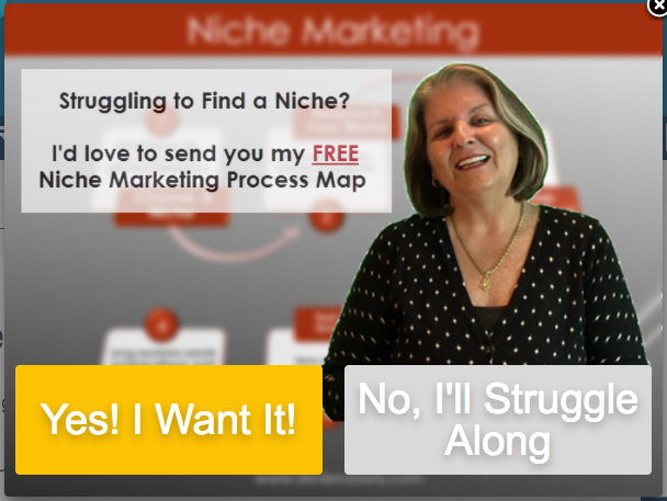
Denise O’Berry specializes in providing small business owners with the right balance of niche marketing methods and tips to improve that ol’ bottom line.
The moment I landed on her website, I was not only impressed with how professional and easy to navigate it was…but her exit intent popup was also pretty eye-catching.
By offering her visitors a choice, Denise is able to use humor and insight to address one of the main pain points of her ideal clients.
#2 – Creating An Emotional Connection
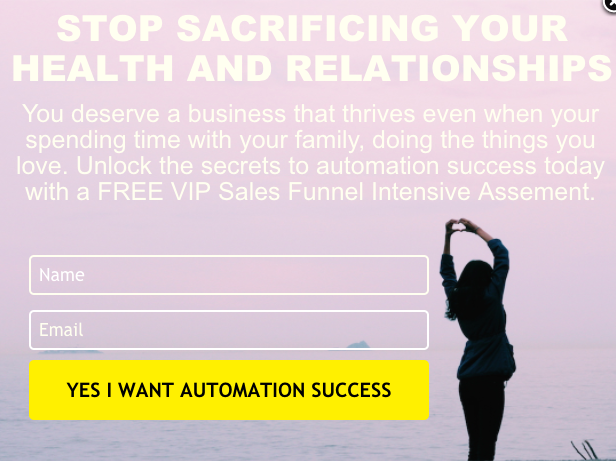
Sarah Murray’s exit intent popup makes an incredibly insightful, emotional appeal to her visitors. By pinpointing a heart-centered, human desire present in her clientele, Sarah’s able to craft an offer that establishes an emotional connection with her visitors.
I really like this popup too because of how well she establishes that sense of calm and peace through the design of her optin. It’s a great example of a subtle contrast between the practical business that she runs and the overall effect of her work.
#3 – Sweet, Polite, and Effective
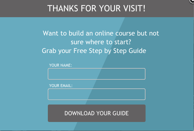
Nathalie Doremieux’s popup is simple and streamlined … and totally on-brand with her business.
I really love how totally polite this popup is. By thanking her visitors first through the popup headline, Nathalie eliminates that frantic salesperson vibe that can be present in an exit intent popup. (Think popups that include lines like “WAIT!” or “Before you go!” or “This is important!”)
And by succinctly inviting you to download her free guide, she makes it very easy to create that first, most important connection with her online visitors.
Check out her exit intent popup in action here.
#4 – Bold & Colorful Attitude
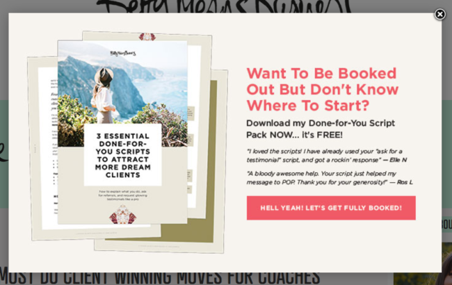
This exit intent popup from Betty Means Business is so bold and attractive!
The download graphics are quick to communicate what she’s offering, while the colors keep things bright and lighthearted.
Betty’s attitude permeates this popup, which totally adds to its appeal.
#5 – Artsy & Adorable
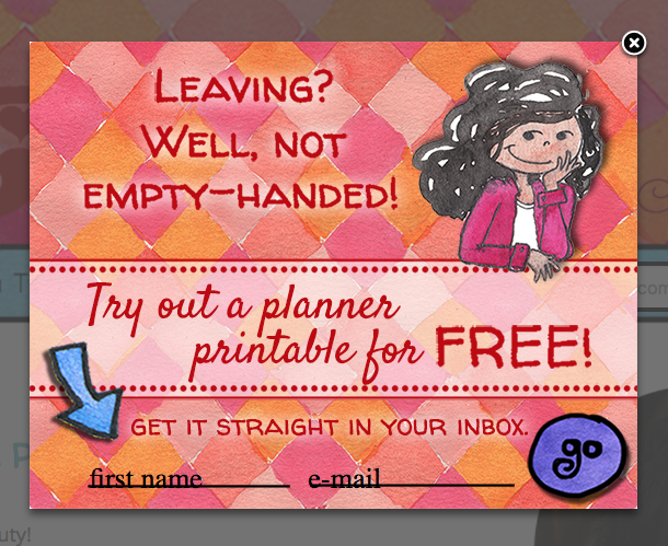
Raine Boyd is one fabulous, fun-filled, incredibly artistic lady…and her website really helps to bring this to light.
So it definitely comes as no surprise that her exit intent popup continues to carry this vibe home.
What I really like about this opt-in offer is that it really allows you to get a sample of her actual work – what she’s about – while still sounding like a gracious hostess.
#6 – Direct, Helpful, and Practical
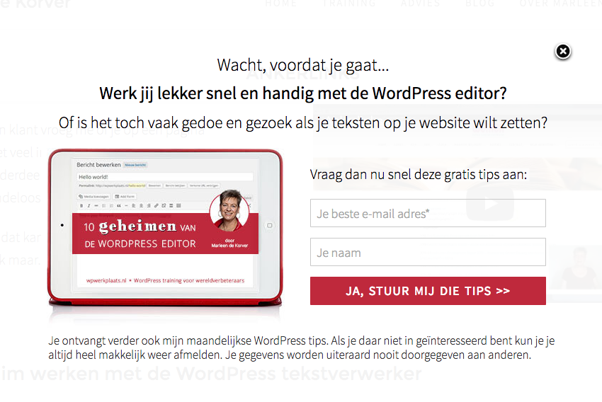
And a rough English translation:
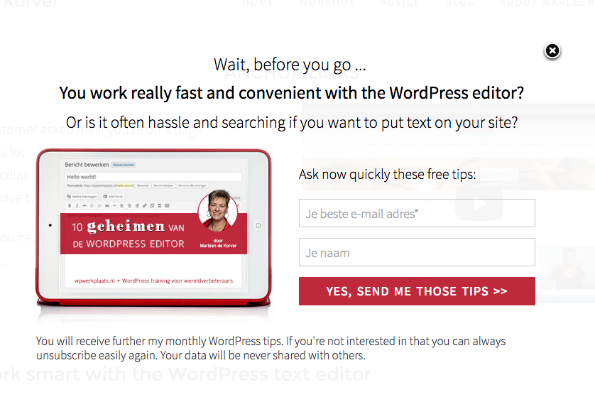
When I saw Marleen de Korver’s exit intent popup I loved the practical, easy format.
By leading with a question, she helps her website visitors to understand immediately whether or not they’re a good fit for her expertise.
If you don’t relate to the question – no problem! Keep on doing what you’re doing.
…but if you think, “Yes! That’s totally me!” then it makes it that much easier to sign up and connect on a deeper level with what Marleen offers.
Never underestimate the power of a simple, direct question.
#7 – The Template You Always Wanted
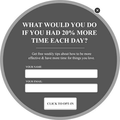
So this exit intent popup example is actually one of the coolest designs I’ve seen, and it happens to be one of the templates that comes free with PopupAlly Pro!
From a design perspective, a rectangular shape is totally, perfectly effective when it comes to your popup optin needs…but there really is something eye-catching and flashy about a round popup.
The other thing I really like about this is that it poses a very open-ended question: the big what if?
As soon as I saw the what-if, my mind immediately leapt to some of the things that are nearest to my heart. And I immediately decided that I needed “in” on the offer. Whatever it may be.
The moment your ideal clients can connect you with what they want, you’re in great shape.
Check out this and other popup templates that come with PopupAlly Pro
You might also want to consider how SumoMe compares to PopupAlly Pro here.
Is Your Exit Intent Popup Right For Your Audience?
There are so many amazing exit intent popup examples out there. The design potential is almost unlimited, leaving it up to you (or your designer) to find the right fit for your website.
While paying attention to design theory will certainly help to make your optin stand out, you’ll also want to make sure that your offer is spot-on.
As long as your exit intent popup connects with your ideal clients, the doors are opened to a future of possibility.
Conclusion
Do you have some amazing exit intent popup examples? Share what’s working for you in the comments below!