This feature is available for PopupAlly Pro users.
For most of the templates in PopupAlly Pro, we offer responsive views.
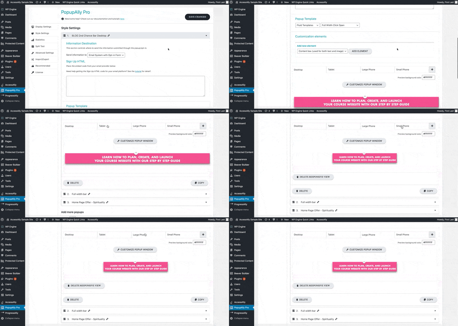
You may find the responsive view settings under Style Settings, and then scroll down until you find the visual builder area.

The views are automatically created based on your original design. However, we highly recommend checking each one, since you can make edits to optimize the appearance. (Editing a responsive view will not affect any other views).
A Note on Cutoff Points
Please note that the “standard” for screen size dimension cutoff points is constantly changing based on what phones are in use in the market. (In other words: a cutoff point that may have been standard a year or two ago could need altering.)
While it’s recommended to do your research and learn the most recent best practices in design, the good news is that your responsive designs in PopupAlly will likely only need slight shifting to bring them up to date.
Fluid Templates
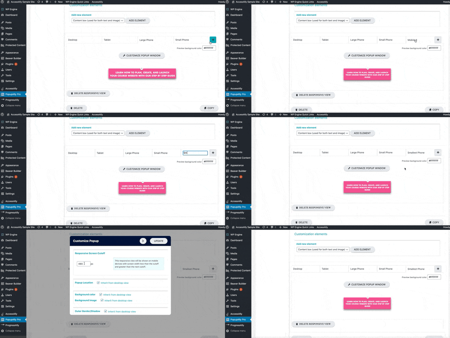
When using fluid templates, you can add new responsive views as needed to really fine-tune your graphics. Click on the “+” button to add a responsive view, then click on the customize popup button to edit the cutoff point (and other popup elements)


Not using a fluid template? Please note that you will be unable to create additional responsive views.